Re-Kraft 2019
Binghamton, NY
After countless submissions and almost 6,000 votes, the Rod Serling Memorial Foundation was chosen as our 2019 Re-Kraft winner.
The Client
Rod Serling Memorial Foundation
Founded in 1985, this Foundation is committed to preserving the legacy of Rod Serling and celebrating his hometown roots in Binghamton, NY. They educate the public about Rod Serling’s genius and passion, his mastery of the creative arts, and his unique understanding of human relationships.
The Challenge
Celebrate and Modernize
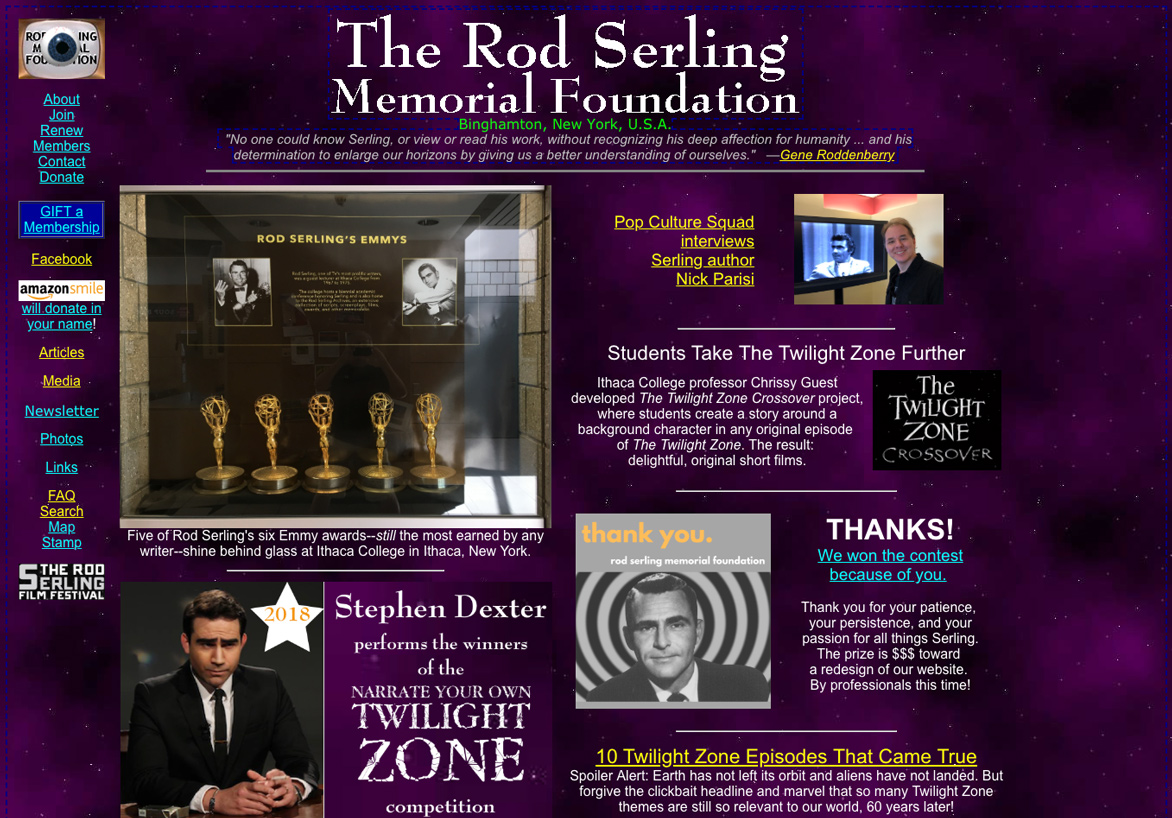
The Rod Serling Memorial Foundation had a vast amount of resources on their website dedicated to everything Rod Serling. However, this huge volume of information was disorganized, with content spanning over three hundred individual pages! The website itself lacked a modern appeal, and many users felt it was overwhelming. Some even feared it might be a spam site and didn’t view it as a reliable source. It was our goal to streamline the content, prioritize information, and make it both visually appealing and in line with current web trends and standards. Ultimately, we also wanted to make it easier for them to increase donations and membership.
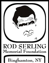
In addition to the website, we also updated the logo. The logo was used inconsistently across all platforms with no formal standard of what the logo was, and it was our goal to create a unified brand marker.
BEFORE


The Solution
The Logo
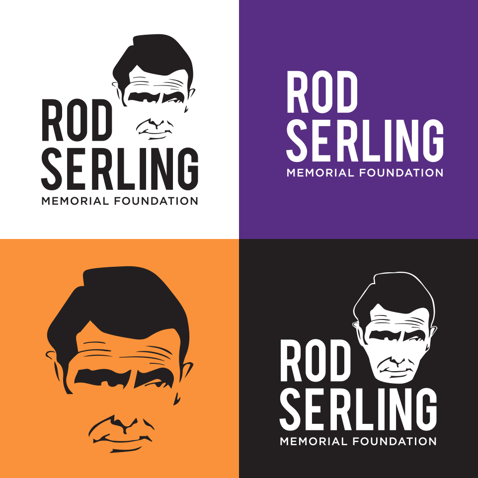
When reviewing the assets that the Rod Serling Memorial Foundation had, we were drawn to a caricature created by Rod’s friend Johnny Hart. This drawing already had equity within the organization and we set to develop it further into a fully fleshed out logo. We added text and made the drawing more graphical for ideal implementation, including different variations and lockups for the organization to use.
LOGO EXPLORATION
FINALIZED LOGO
The Website
The Rod Serling Memorial Foundation wanted to emphasize Rod Serling’s achievements beyond the Twilight Zone. The previous website housed many archival materials and educational resources, but they were disorganized and hard to locate. The site wasn’t responsive, text was hard to read, and it lacked hierarchy.
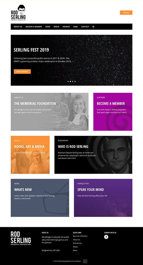
We explored two redesign options that better aid the Foundation’s pledge. The client chose the more traditional of the two options, with a grid-based structure that would be easy to update with new material.
The clean and modern layout is optimized to increase members and educate the public, while making resources more readily available and presenting information in a more digestible and organized manner.
Before

After
“
This work is absolutely gorgeous.
WHAT A GIFT! We are so very grateful.
Jackie Stapleton, Advisor
”